Sales-Performance-Interactive-Dashboard
Sales Performance & Profitability Dashboard (Power BI)
Project Overview
This project is an interactive Power BI dashboard built to analyze sales performance and profitability across different dimensions such as time, customers, products, regions, and segments.
The dashboard is designed with a clean UI, interactive slicers, KPIs, and page navigation using icon buttons to provide a smooth user experience.
Objectives
- Analyze overall sales, profit, and quantity trends
- Identify top-performing and loss-making customers, products, and cities
- Understand customer and regional performance
- Enable easy navigation between multiple dashboard pages
Key Features
- Multi-page interactive Power BI dashboard
- Custom page navigation using icon buttons
- Dynamic slicers for filtering data
- KPI cards for quick insights
- Time-based analysis using moving averages
- Clean and consistent dashboard theme
Dashboard Pages
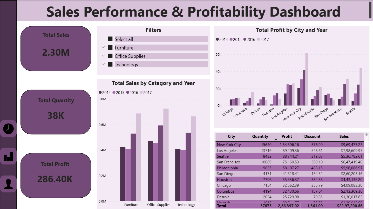
1.Sales Overview
- Total Sales, Total Profit, Total Quantity (KPI Cards)
- Sales by Category and Year
- Profit by City and Year
- Category-based filters
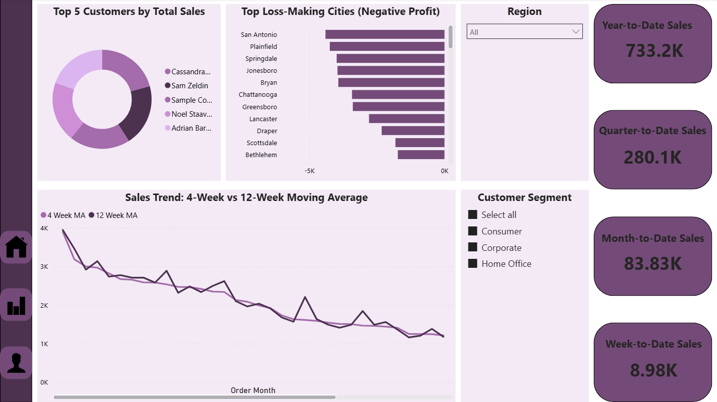
2️. Customer & Time Analysis
- Top 5 Customers by Total Sales
- Top Loss-Making Cities (Negative Profit)
- Sales Trend: 4-Week vs 12-Week Moving Average
- Order Date & Ship Date analysis
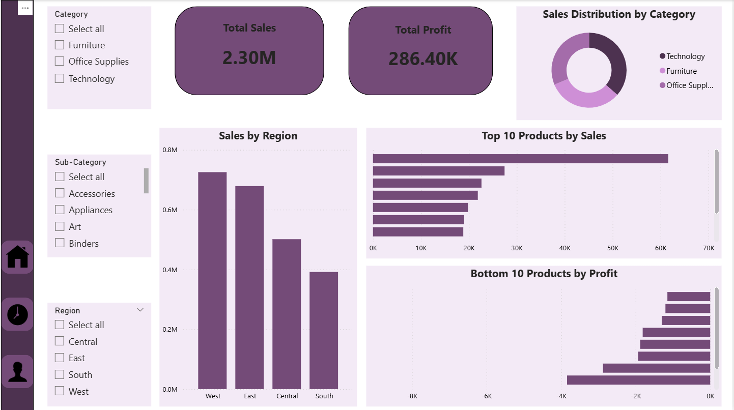
3️. Product & Regional Analysis
- Top 10 Products by Sales
- Bottom 10 Products by Profit
- Sales Distribution by Category
- Sales by Region
- Region, Category, and Sub-Category slicers
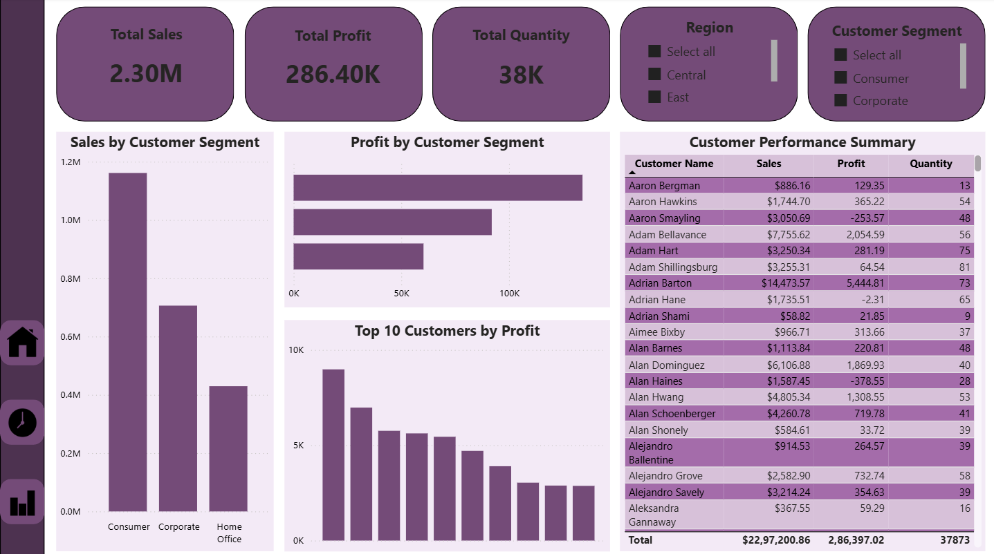
4️. Customer & Segment Performance
- Sales by Customer Segment
- Profit by Customer Segment
- Top 10 Customers by Profit
- Customer Performance Summary table
- Region and Customer Segment slicers
Dashboard Preview
Tools & Technologies
- Power BI Desktop
- DAX (Basic measures & calculations)
- Data Modeling
- Interactive slicers & buttons
- Data visualization best practices
Files Included
Sales_Performance_Dashboard.pbix– Power BI dashboard filescreenshots/– Dashboard preview imagesREADME.md– Project documentation
How to Use
- Download the
Sales_Performance_Dashboard.pbixfile - Open it using Power BI Desktop
- Use slicers and navigation icons to explore the dashboard
- Analyze insights across different pages
Key Learnings
- Designing multi-page Power BI dashboards
- Using slicers effectively without conflicts
- Implementing page navigation with icon buttons
- Creating business-focused visualizations
- Improving dashboard usability and layout
Author
Wince S
Aspiring Data Analyst
Skills: Power BI | Data Visualization | DAX | Data Analysis
⭐ If you like this project
Feel free to ⭐ star the repository and share feedback!